Using GEPHI to Create a Network Graph
from an Autosomal DNA Matrix

Copyright © 2025 by Wesley Johnston - All rights reserved - but free to use the method
Created 31 Mar 2025 - Last updated 1 Apr 2025

GEDmatch supports tag groups of multiple kits for analysis of a group of kits in an autosomal DNA project. The GEDmatch Autosomal DNA Matrix tool can then be applied to that tag group. It generates an n by n matrix (where n is the number of kits) in which each cell contains the number of centiMorgans of autosomal DNA that the two people who intersect at that cell share. The Autosomal DNA Matrix is an effective tool for identifying which kits in an existing tag group match each other and how much they match. But viewing the matrix as a network graph provides further insight into how the kits connect and cluster.

In our Butson Research Group, we now have 45 kits of descendants of Butson ancestors. While the Autosomal DNA Matrix presents a 2-dimensional grid view of all the connections, Barbara Rae-Venter's presentation at the 2025 Institute for Genetic Genealogy (i4gg) conference led to me to wonder if using GEPHI to create a network graph from the Autosomal DNA Matrix might provide some insight that we could not easily see in the grid format. So, this page explains how to create a network graph of the data in an autosomal DNA matrix. There are many more parameters in GEPHI that people may want to use to enhance their graphs for their own objectives.

All names and kit numbers on this web page are fabricated and not the real names or kit numbers of any tester.
-- Wesley Johnston

GEPHI Download and Install

You can freely download GEPHI from the gephi.org website. Installation is simple.

The Input File

The GEDmatch Autosomal DNA Matrix is the input file. You can use CTRL+A to select the entire page and then CTRL+C to copy the selection. You can then paste the result into a spreadsheet and eliminate all but the labels and the cells. (NOTE: If you only use this for your own research and do not publish it, I believe you are within GEDmatch rules, although the rules do not seem to take into account autosomal DNA group users of group tools and seem framed within the uses of individual users.)

You do have to modify the labels, both down the side and across the top. I concatenate the kit number and name, separated by a hyphen so that I have a single column of labels on the left instead of a kit number column and a kit name column. I then copy that entire column and paste it transposed into the top row, which was originally just the kit numbers.

That is it. The input date setup is pretty simple. Here is part of the input for the following instructions.


Modified Autosomal DNA Matrix Input File to GEPHI

GEPHI Input Process

TIP: GEPHI has no "undo" function. So, it is good to do frequent saves so that you can experiment with different features and go back to a saved version if you do not like what the feature has done to the graph.

Start GEPHI and select "New Project". Then click on "File" and "Open" and select the spreadsheet file you created with the GEPHI input of the Autosomal DNA Matrix.

Note that GEPHI detects that the spreadsheet is a matrix and sets the "Import as:" option to Matrix. This is one of the differences from the DNA match list input described in Nicole Dyer's instructions: we have only one file and not separate files for nodes and labels. (Note that this image is from my generations matrix instructions for a different data set, but the highlighted places are the same.)

Click "Next". Then on the next popup window, click "Finish".

This will open the "Import report" popup window. The number of nodes should be the number of kits in your Autosomal DNA Matrix. The number of edges will vary depending on how many of the kits have cells with MRCA generation estimates. In this window, change the "Graph Type" to "Undirected". Then click "OK".

This will pop up the warning "Issues after import process" window stating "- mutual edges removed to fulfill undirected type". Simply click "Close". I do not fully understand this setting. But the resulting graph appears to be okay.

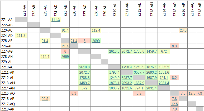
Working with the Graph

The graph will initially appear as a black graph, which may be a solidd "hairball" mass if you have a lot of kits in your project. You need to spread the graph apart so that you can see the nodes and how they connect. You also need to identify clusters and color them so that the graph allows you to visualize the clusters. You masy also need to reduce the dimensionality to include only the most-connected kits so that the graph is not overly complex. And you need to label the nodes and resize the labels and also maybe resize the edges (the connecting lines) based on how many cMs they represent.

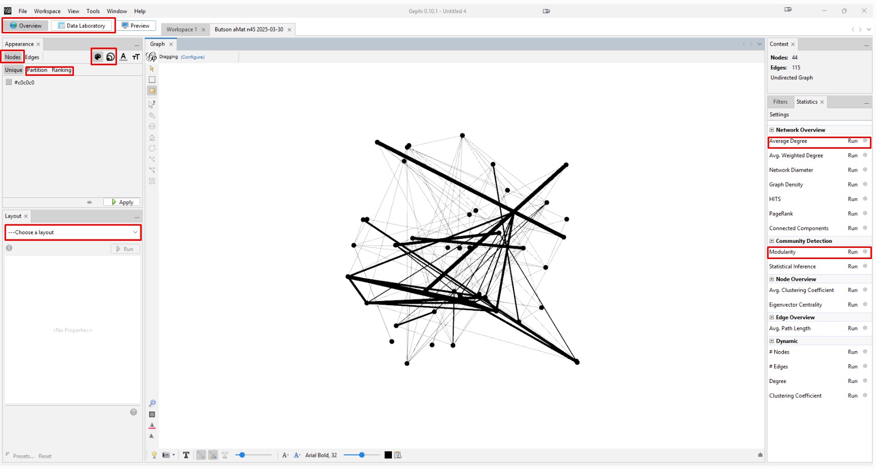
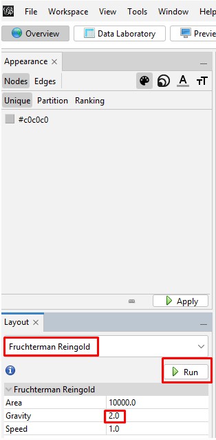
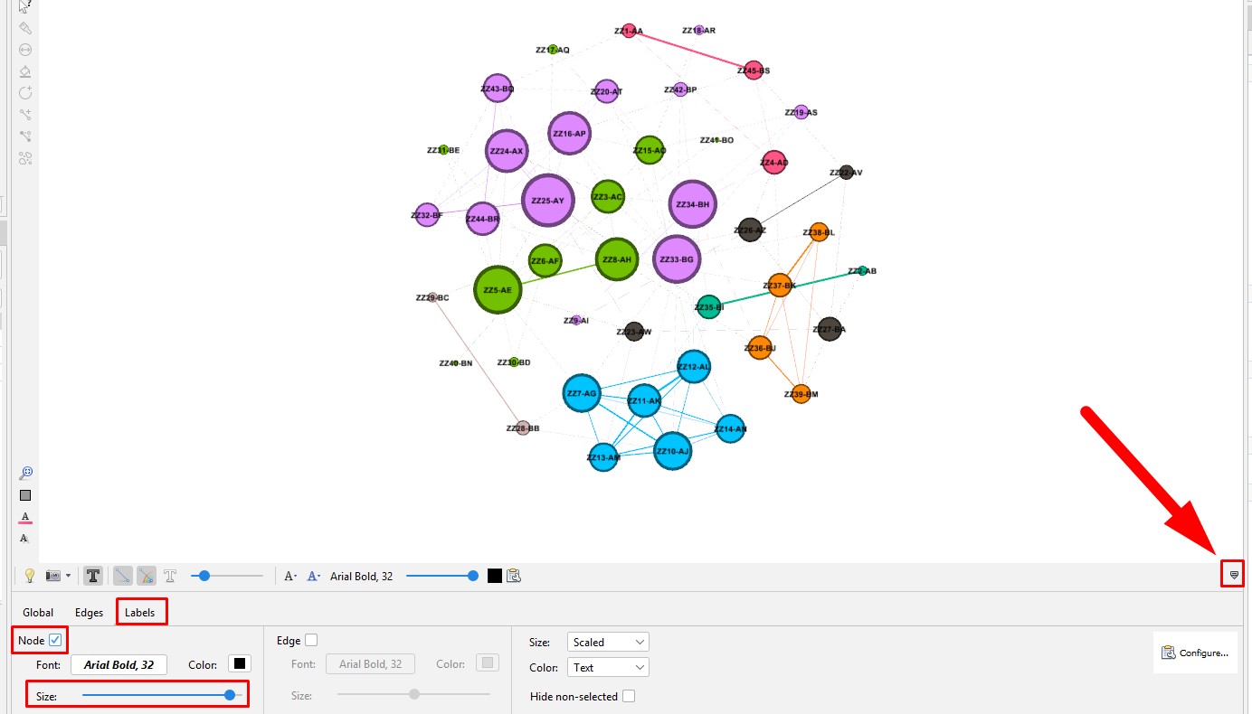
This image highlights the key places to click in the following steps. The control panel is definitely daunting because it has so many features.

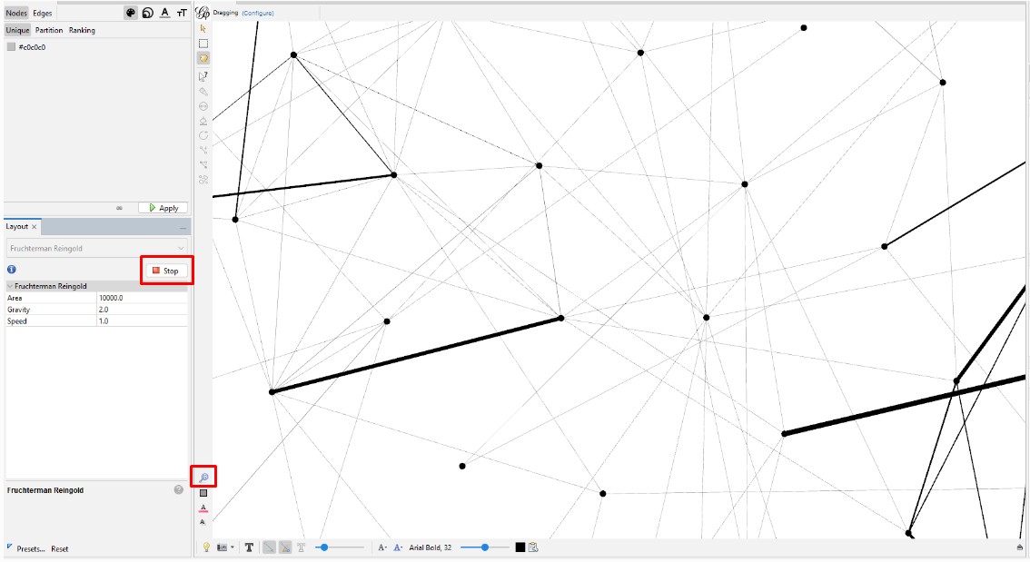
Spreading the Graph Apart: The graph's overall visual shape varies depending on which "Layout" you choose in the "Overview" tab on the left side tool bar. After experimenting with different layouts, I opted for the "Fruchterman Reingold" layout with its default parameters. Choose that layout from the pulldown menu, change the "Gravity" to 2, and then click "Run" and then click "Stop". You can always recenter the graph image with the magnifying glass icon at bottom left and zoom in or our with the scroll wheel on your mouse. Zooming does focus on where on the graph you hover your cursor.

Run then Stop

Reducing the Dimensionality: Since this case has only 45 kits, dimensionality reduction is not necessary. But if you have a real "hairball" you will need to reduce the dimensionality so you can focus on the most connected kits. I explain the steps to do this in my instructions on my web page on generations matrix graphs.

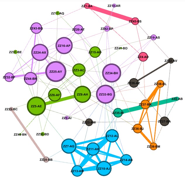
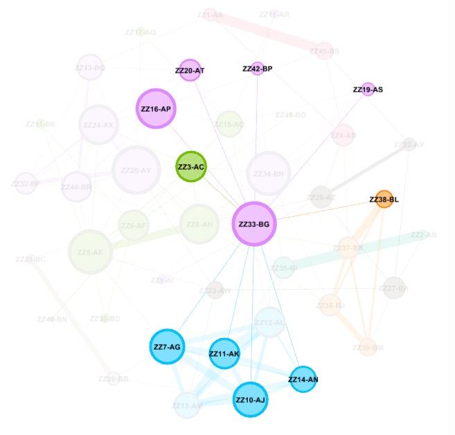
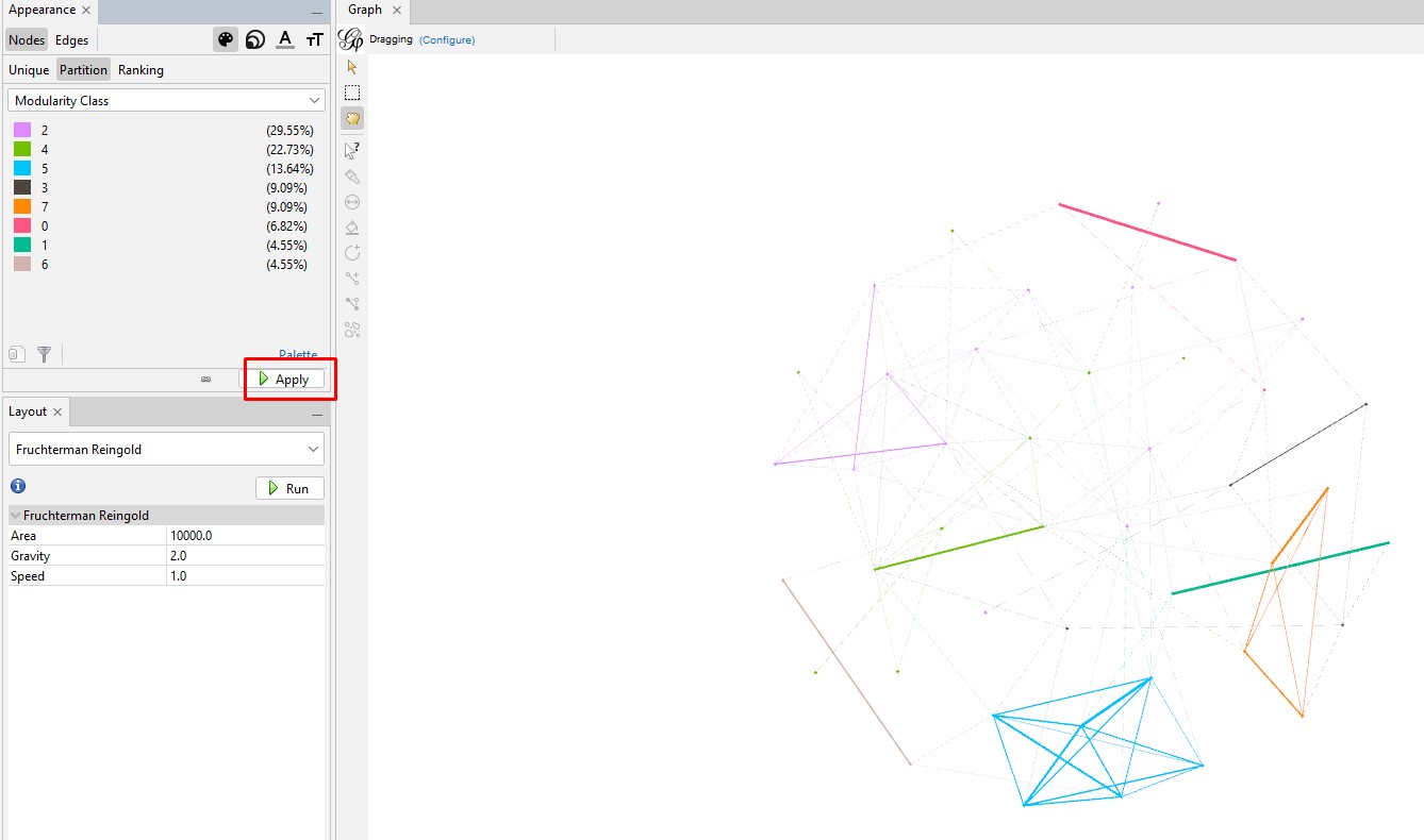
Create and Color Clusters: Now, we need to identify the similar clusters people and give the clusters different colors so that we can start to make some sense of what we see in order to try to gain insight from the graph. In the "Statistics" tab, click on "Run" on the "Modularity" line of the "Community Detection" section. Use the defaults, and click "OK" in the popup window. This is a non-deterministic operation so that if you click "Run" again, it will give a slightly different number. It uses the Louvain community detection algorithm which Dr. David Stumpf reports in his "Graphs for Genealogists" software does a very good job of separating out the different branches of his own family tree.

Back on the left side tool bar, in the "Appearance" section's "Nodes" tab's "Partition" tab, select the attribute of "Modularity Class". Then click "Apply". Since the default is that the icon of an artist's palette was selected, you will see that each cluster/class has a unique color and number (starting from class 0). Once you click "Apply", your graph will show these colors applied to it.


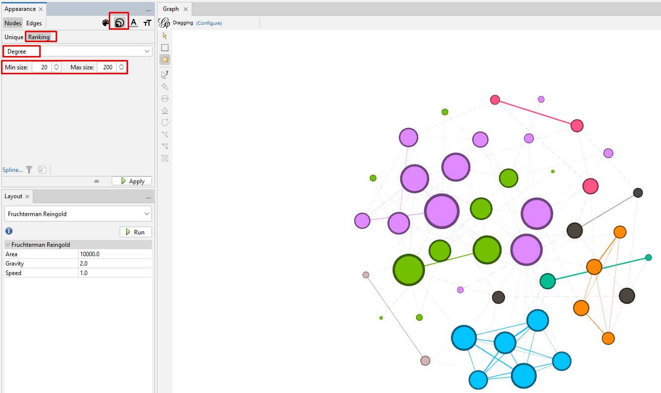
Enhancing the Nodes and Edges: So far, our nodes show and edges show no information other than the connections. We need to know which testers are in which nodes, and it will be useful to set the node's circle size based on how connected that person is to the others in the Autosomal DNA Matrix. In the "Appearance" section, click on the nested circles icon at the top (to the right of the artist's palette icon). Then in the "Ranking" tab, click on the "Degree" attribute in the pulldown list. I change the minimum size to 10 and the maximum to 200. Then click "Apply". Keep in mind that, because these are the most-connected people, even the smallest circles are highly connected.

Set the node labels on the tool bar at the bottom of the "Graph" section. At the right end of the bottom toolbar is a stylized up-arrow (looks like a tiny house). Click on that to open the full toolbar. Then click on the "Labels" tab. Click the empty box to check the "Node" section. You can change the font or use the slider to make the labels larger or smaller.

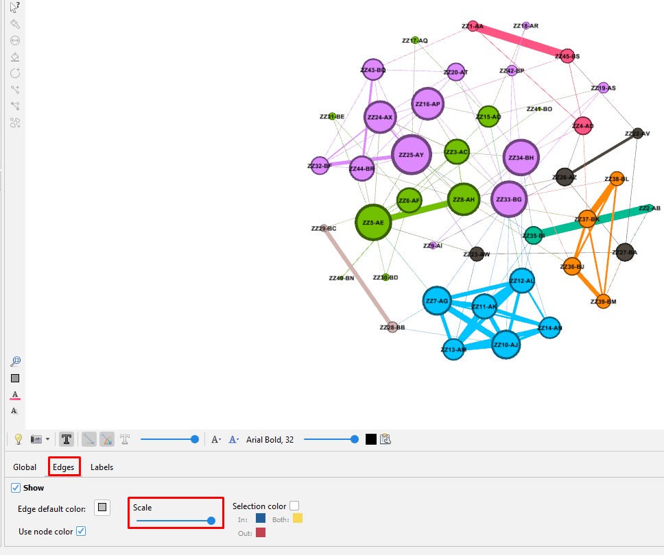
Set the edge size on the tool bar at the bottom of the "Graph" section. Click on the "Edges" tab. Use the slider to make the labels larger or smaller.

What Next?

Here is how our final graph looks.

If we hover the cursor over a node, we can see all the other highly-connected testers who the kit matches.

You can export the graph to a PDF file where it can be zoomed and shared. This is done in the "Preview" section but requires a good deal of tweaking since it is not WYSIWYG.

I would really like to find a way to export the graph to a web page where it can be shared in a way that it can be interactively explored. But I have not really looked for that yet.