Using GEPHI to Create a Surname Connection Graph
Copyright © 2024 by Wesley Johnston - All rights reserved
Created 10 May 2024 - Last updated 11 May 2024

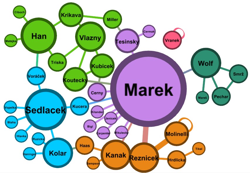
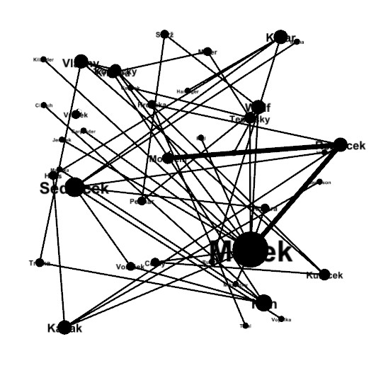
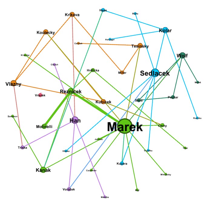
This web page shows how to create a graph of the surnames from marriages so that we can see how the different families connect to each other. Here is an example of what that might look like.

In my one-place study of Chicago's Grand Crossing Czech community, I now have 135 marriages for which I have the surnames of both husband and wife. Since these are all long-deceased people, I will use their actual names to show the steps by which I generated the surname connection graph. -- Wesley Johnston

GEPHI Download and Install
You can freely download GEPHI from the gephi.org website. Installation is simple.

The Input File

The input file is simply a list of the pair of surnames for every marriage. However, this takes a good deal of data preparation to make the result best. The data preparation has these steps:

  1. I download the master marriage list from my database on Legacy Family Tree into an Excel spreadsheet.
  2. I first use Excel formulas to create columns of only the surnames of the husband and wife.
  3. I then "clean up" the data by removing the marriages for which one or both surnames are not known.
  4. I also standardize the spelling of the surnames so that the same families show in the same node of the graph and also so that I eliminate any diacritical marks of the Czech surnames.
  5. I then duplicate the list with the names of the husband and wife switched so that both lists have all the surnames.
  6. I then save the file with the first worksheet being my input to GEPHI.

The Input File - Step 1: Download Master Marriage List

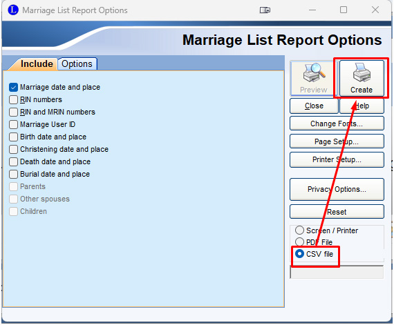
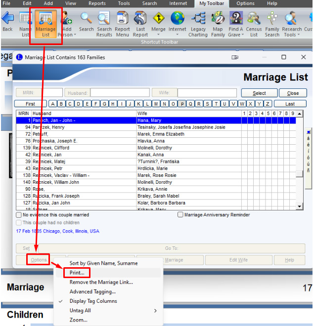
Presumably, other genealogical database software programs allow viewing and downloading a list of all the marriages in the database. I used Legacy Family Tree to do it. (If you don't have Legacy and want to use it for this, you can download it free at https://legacyfamilytree.com/DownloadLegacy.asp and import your GEDCOM into it.) Click on "Marriage List". Then click "Options" and "Print ...". In the new window that pops up, click the check circle for "CSV file" and then "Create" to save the marriage list to a CSV file with whatever name you want in whatever folder you want.
The Input File - Step 2: Create columns with just the surnames

Open the downloaded file in Excel. It will look like this.
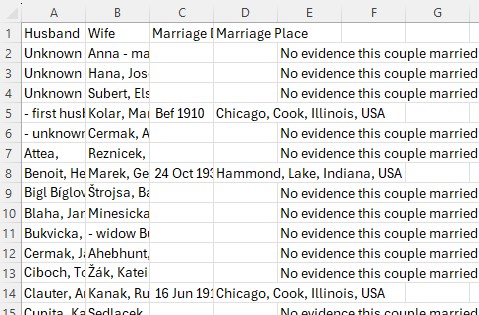
In two adjacent blank columns to the right (I title them "Hsur" and "Wsur" for Husband and Wife surnames), in the second row, enter this formula for the Hsur column:

=LEFT(A2,FIND(",",A2)-1) -- which finds the location from the left of the first comma in the husband's name field and then sets the surname to the text to the left of the comma

And enter this formula for the Wsur column:

=LEFT(B2,FIND(",",B2)-1) -- which finds the location from the left of the first comma in the wife's name field and then sets the surname to the text to the left of the comma

Then copy these formulas all the way down for every row. And what you see for the results looks like this:
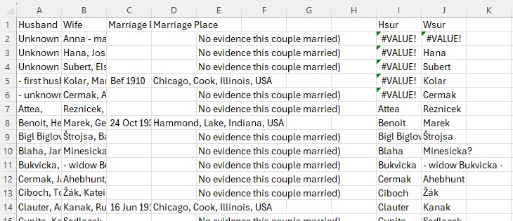
The Input File - Step 3: Remove marriages for which one or both surnames are unknown.

Copy the worksheet to a new worksheet to the left of the original worksheet. Then in the new worksheet, copy the two calculated columns and paste them back on top of themselves using "Paste Special" and checking the circle for "Values". This locks in the surnames so that they are not dependent on the formulas. This allows you to then delete all the columns to the left of the two surname columns so that your worksheet looks like this:
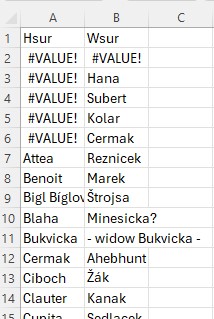
Now go row by row through this worksheet, and delete any row where one or both the husband and wife do not have a surname. For example, in the above image, delete all rows that have "#VALUE!", and delete the row where the wife surname is "- widow Bukvicka -". (If you have a lot of marriages, you can sort by the surnames in order to group the changes to make them easier to deal with.) And now your worksheet looks like this:
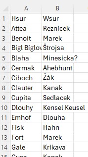
The Input File - Step 4: Standardize the surnames, including removing diacritical marks.

The spelling determines the nodes in the graph. In order for the same family to be considered the correct number of times, their surname has to be the same spelling in every marriage. Some examples: (a) standardize Hahn, Hana and Hann to just one of these spellings (b) Dlouhy and female Dlouha standardize to Dlouhy (a Slavic language convention).

I also remove the diacritical marks and any other punctuation as part of this process. The result is the final list of all the standardized surnames for every marriage that has surnames for both the husband and wife.

The Input File - Step 5: Duplicate the list with the names of the husband and wife switched so that both lists have all the surnames.

The columns we have been calling husband and wife will not be separately included as surname nodes. So, if there are three marriages with wives named Tesinsky, GEPHI will not include the surname Tesinsky if there is no husband with that name. And even if there is a male with the surname, GEPHI will not count the instances of wives in determining how many marriages have the surname Tesinsky as either husband or wife. To remedy this, we copy all the husband surnames and paste them at the end of the wives' surnames list and vice versa.

The Input File - Step 6: Save the file with the first worksheet the one with just the doubled list of surnames.

Save the file as an Excel file and not a CSV file. In step 3 above, we copied the surname-only worksheet to be the first (left-most) worksheet in the spreadsheet. Make sure that is where it is when doing the save since GEPHI will look at the first worksheet for the data. You are now ready to begin working with GEPHI.

GEPHI Input

Start GEPHI and select "New Project". Then click on "File" and "Open" and select the spreadsheet file you created with the GEPHI input of the Generations Matrix.

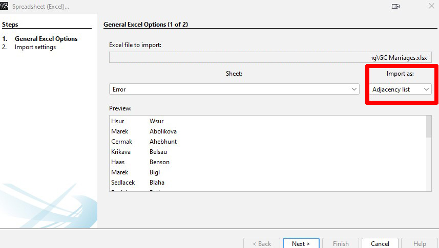
Note that GEPHI detects that the spreadsheet is an adjacency list and sets the "Import as:" option to "Adjacency list".

Click "Next". Then on the next popup window, click "Finish".

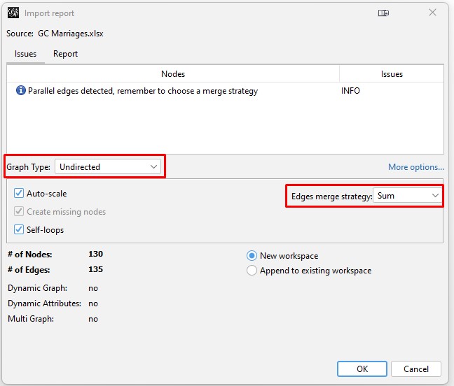
This will open the "Import report" popup window. In this window, change the "Graph Type" to "Undirected" and the "Edges merge strategy" to "Sum". Then click "OK". The graph is undirected because we are simply wanting to show which surnames connect with each other. The "Sum" will result in thicker lines connecting two different surnames if they have more connections.

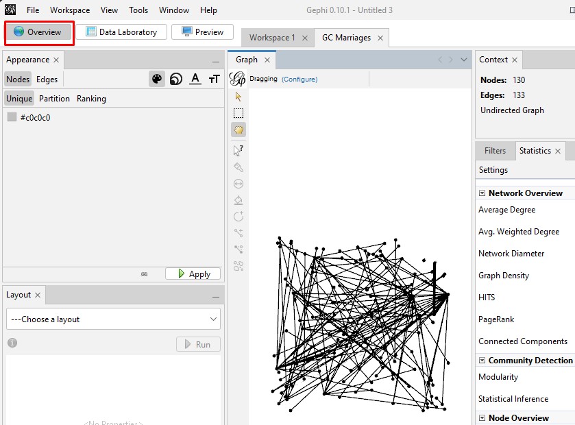
This completes the import and opens your GEPHI dashboard. If it does not show the graph, click on the "Overview" tab at top left to see it.

Working with the Graph

The graph includes many surnames that appear only once in the marriages. We need to reduce the dimensionality to include only surnames that are in at least two marriages so that the graph is less cluttered. And we need to label the nodes so that you know what you are seeing and also change the size of the nodes so that the surnames that appear most in the marriages are the largest nodes. Then we can also color the nodes based on how they cluster together.

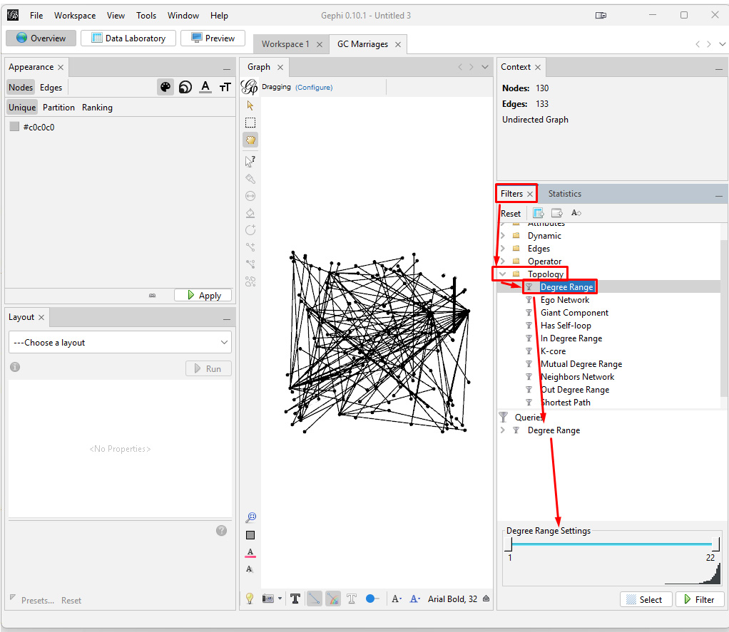
Reducing the Dimensionality: Each node is a unique surname. The "degree" of each node is how many marriages that surname is in. In my data, 54 of the surnames only appear once. So, to reduce clutter in the graph, I want to focus only on the surnames that appear in at least two marriages. On the right side, click on "Filters". Then double-click on "Topology" to see the options where you can double click on "Degree Range". This will put Degree Range in the Queries box and show the degree range in a compressed chart at the bottom.

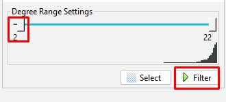
Then, slide the left end of the range to 2, and click the "Filter" button.

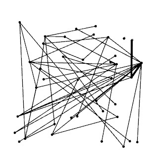
And the filter reduces the clutter in the graph.

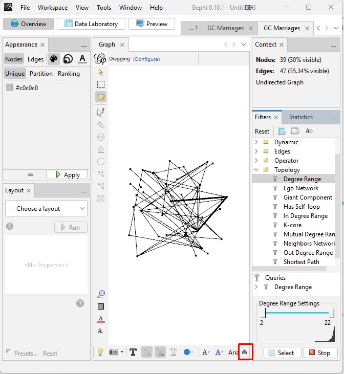
Label and Scale the Nodes: (NOTE: I had to take a break since the last step, and each configuration of the graph is different when you start again without saving. So, this graph looks a bit different from the one in the prior step but is still the same graph.) Start by clicking on the small up arrow at the bottom right of the center pane.

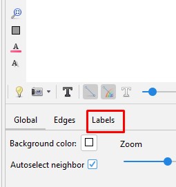
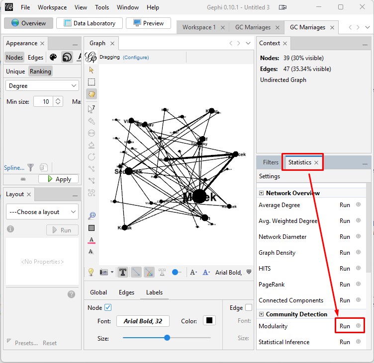
This will reveal the controls at the bottom. Click the "Labels" tab name.

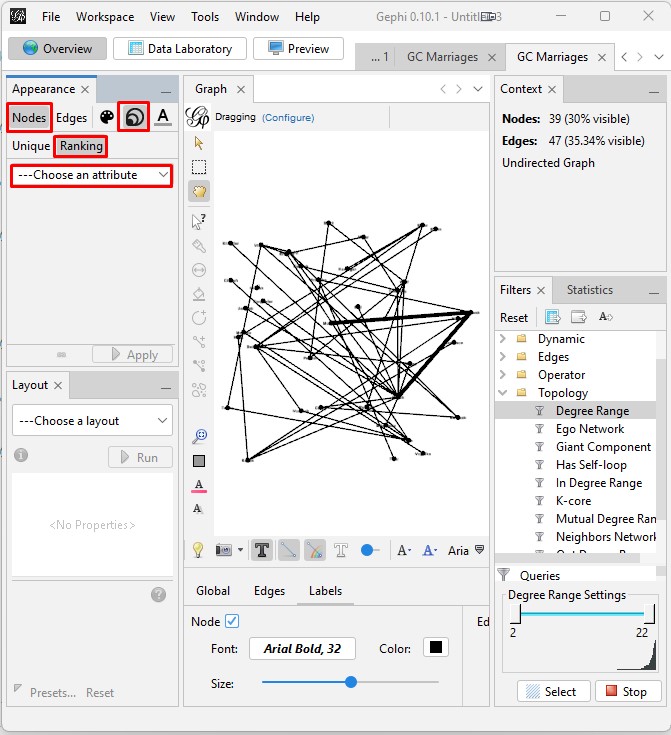
Then check the "Nodes" box. Then set the "Size" to "Node Size". You won't see that take effect yet since we have not altered the node sizes.

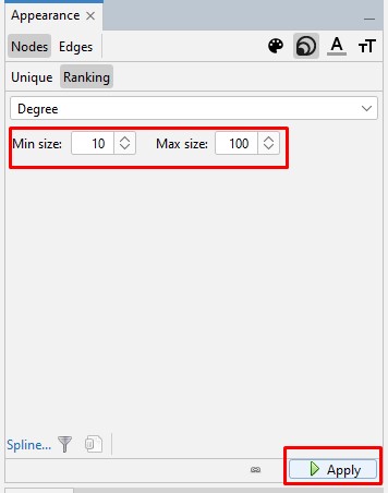
So, now we go to set the node sizes. At the upper left, click on Nodes and then on the node size icon (expanding circle sizes) then on Ranking. Then in the "Choose attribute" box, choose "Degree".

Here you need to play around a bit with the "Min size" and "Max size" values to see just what works best for you. Click "Apply" to see the impact of the values on the graph.

Here is how the graph looks now.

These steps and the next steps in configuring the graph are all steps where you may want to come back and change parameters as you see how things are shaping up. You might even want to go back to the filter and increase the bottom limit to reduce the number of surnames. It is all about becoming satisfied with the graph to your needs.

Create and Color Clusters: There may be statistically separable clusters within the surnames. It is very helpful to let the software discover those and then color the nodes and edges accordingly. On the right panel, click the "Statistics" tab, and then click "Run" for "Modularity". This will pop up a window where you just click "OK". And then another window will pop up with a grid, and you can just close that.

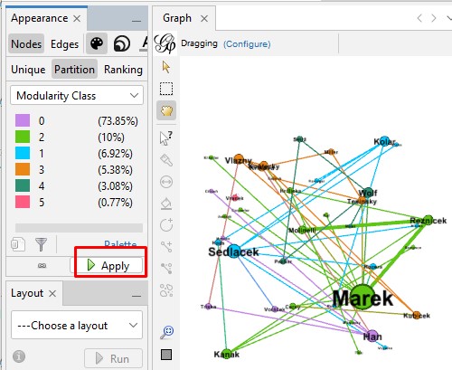
Now we apply the modularity clustering to the coloring of the nodes and edges. At the left, click on the palette icon for "Nodes" and then the "Partition" tab. Then select "Modularity Class" as the attribute on which to partition the nodes.

Simply click "Apply" to apply the colors.

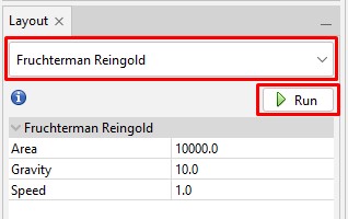
Spreading the Graph: The graph can be made more compact and also more attuned to the clusters. You can try out different layouts in the "Layout" control section on the left. For example, to try the "Fruchterman Reingold" layout, choose it from the list of layouts, and then click "Run". You then click "Stop" after it has converged to a stable configuration. Beware: there is no "Undo". You may want to do saves before you try layouts so that if you want to go back to one that you liked better then you can do that.

Here is how the "Fruchterman Reingold" layout looks on the graph. I can already see that I want the "Min size" (which we set above) made larger so that all the surnames are legible. That may lead me to also increase the "Max size".

Additional Controls: It is useful as you work with the graph to fine tune it to your needs that you know some additional controls. These are all on the left side of the center pane, two at the top and one near the bottom.

  • The yellow arrow allows you to click on a node and see all the nodes to which it connects.
  • The yellow hand allows you to click on a node and drag it to a different place on the graph.
  • The magnifying glass with a square in it allows you to recenter the graph and zoom it to fit within the pane.

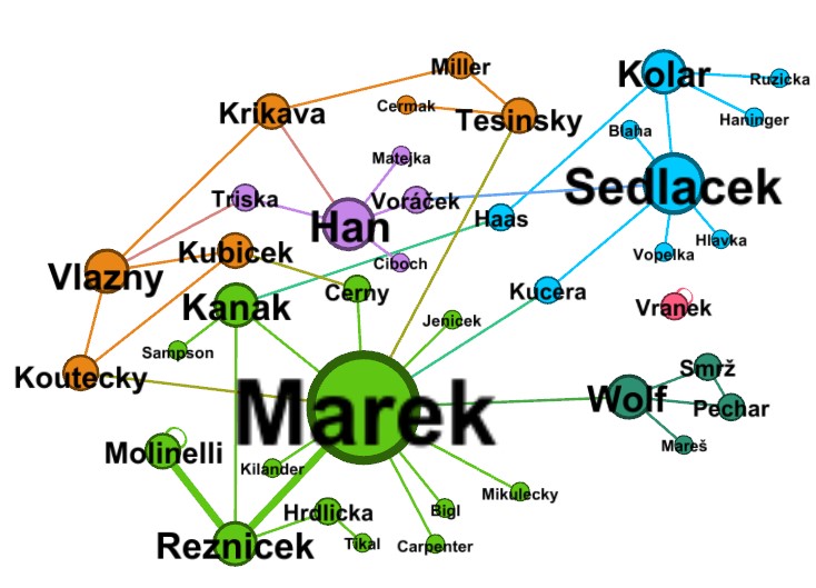
The Final Graph

After tweaking parameters and moving nodes around, here is the final graph. It very nicely shows how the different clusters connect and which surnames connected the most. I see that I did not remove all the diacritical marks. But those names that had them were consistently spelled so that it is okay to include them. I also see that a Kolar widow with the maiden name Sedlacek who married a Hlavka is showing only with her maiden name on the marriage Sedlacek-Hlavka. That is the standard that I use.