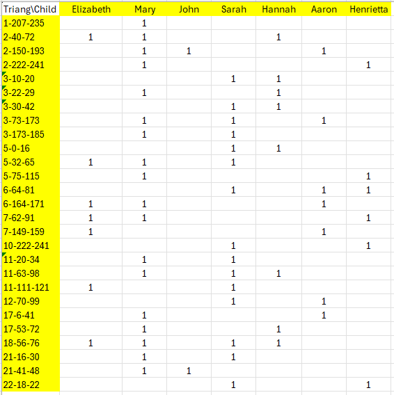
Triangulated regions of descendants of the children
of Christopher Lake and Susannah Cousins
(chromosome-start-end)
|
of Triangulated Descendants Copyright © 2026 by Wesley Johnston - All rights reserved - but free to use the method Created 3 Mar 2026 - Last updated 4 Mar 2026
|
|
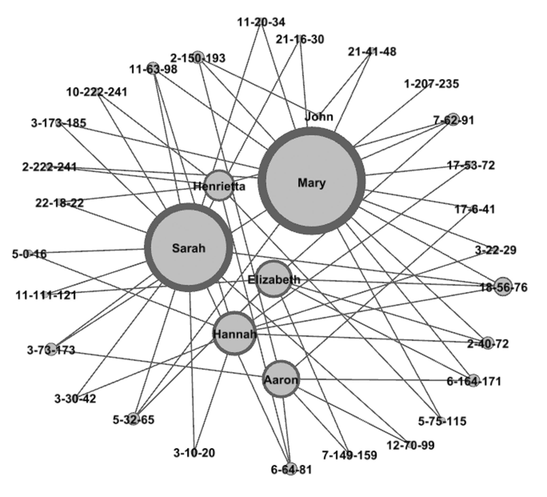
GEDmatch supports tag groups of multiple kits for analysis of a group of kits in an autosomal DNA project. A tag group of DNA-tested descendants in well-focused autosomal DNA project can reveal significant DNA evidence for connections dating back to the 1700s. This web page gives the detailed steps used to create a graph of one such case. Well over 100 (151 as of this writing) descendants of John Lake and Anne Spicer (married about 1649 in New Amsterdam) joined together in a very well-focused autosomal DNA project to create a GEDmatch tag group of all of their autosomal DNA results. Many of the testers descended from Christopher Lake and Susannah, whose maiden name was not known from any records but which the DNA results showed with very strong evidence to be Cousins. The paper trail left some branches with no records to support their connection to the family. But the combined DNA results showed extremely strong evidence for the connections that could never be documented. One of the tools used in this study was a graph showing how the DNA-tested descendants of six of the couple's children triangulate with each other on a total of 27 regions of shared DNA. There is no one shared region on which they all connect. Instead there are many regions of shared DNA inherited from their common ancestral couple (who were blessed with having descendants who spread far and wide and never stayed more that 2 or 3 generations in the same place and thus avoided intermarriages for the most part). The graph shows how all of these triangulations among descendants of all six children tie them together in a single image, showing the chromosome number and start and end points for each triangulated region of DNA. Since no names of living people are in the data, the graph shown here uses the actual names of the six children of Christopher and Susannah.
|
|
You can freely download GEPHI from the gephi.org website. Installation is simple. |
|
The input is generated by running GEDmatch multiple kit analysis tag group triangulations with different descendants moved to the first position in the tag group to make them the reference person. All of the triangulation group identities (chromosome-starting location-ending location where the locations are captured in just the millions positions) are then listed as rows in a spreadsheet. The children of Christopher and Susannah each have their own column. The number 1 (one) is placed in any cell of the spreadsheet for which that child has a descendant who inherited that triangulated region of DNA.
|
|
TIP: GEPHI has no "undo" function. So, it is good to do frequent saves so that you can experiment with different features and go back to a saved version if you do not like what the feature has done to the graph. Start GEPHI and select "New Project". Then click on "File" and "Open" and select the spreadsheet file you created with the GEPHI input of the matrix of triangulations. Make sure that the "Import as:" option is set to Matrix (as in the red box in the image). 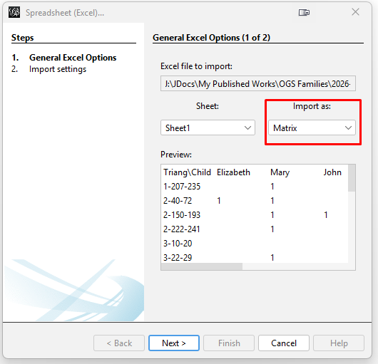
Click "Next". Then on the next popup window for "Import settings (2 of 2)", click "Finish". This will open the "Import report" popup window. While it does show a warning, it seems that this does not cause a problem later. In this window, change the "Graph Type" to "Undirected". Then click "OK". 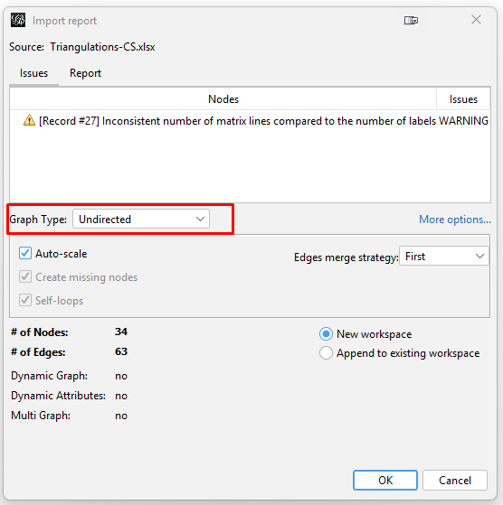
This will pop up the warning "Issues after import process" window stating "0 mutual edges removed to fulfill undirected type". Simply click "Close". I do not fully understand this setting. But the resulting graph appears to be okay. |
|
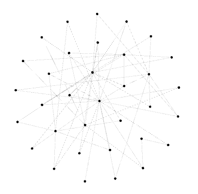
The graph will initially appear as a bunch of dots (nodes) and lines (edges). This image highlights the key places to click in the following steps. The control panel is definitely daunting because it has so many features. 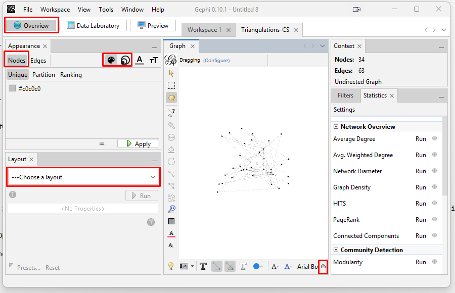
TIP: To re-center the graph, click on the magnifying glass icon on the lower right of the "Graph" pane. You can zoom in or our with the scroll wheel on your mouse. Zooming does focus on where on the graph you hover your cursor.. You need to spread the graph apart so that you can see the nodes and how they connect. You also need to label the nodes and resize the nodes based on how many triangulations in which they appear. Spreading the Graph Apart: The graph's overall visual shape varies depending on which "Layout" you choose in the "Overview" tab on the left side tool bar. After experimenting with different layouts, I opted for the "Fruchterman Reingold" layout with its default parameters. Choose that layout from the pulldown menu, and then click "Run" and then click "Stop". This spreads the nodes apart into a circular shape.
Reducing the Dimensionality: Since this case has only a few nodes, dimensionality reduction is not necessary. But if you have a real "hairball" you will need to reduce the dimensionality so you can focus on the most connected kits. I explain the steps to do this in my instructions on my web page on generations matrix graphs. Sizing the nodes: On the left side tool bar, in the "Appearance" section's "Nodes" tab's "Partition" tab, select the concentric circles icon and "Ranking". Then choose Degree from the "Choose an attribute" pulldown menu. Degree is a measure of connectedness of a node: the more other nodes to which it is connected the higher the degree. Change the Max size to 100, and click "Apply". 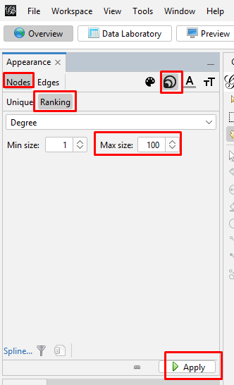
Your graph will now look something like this. 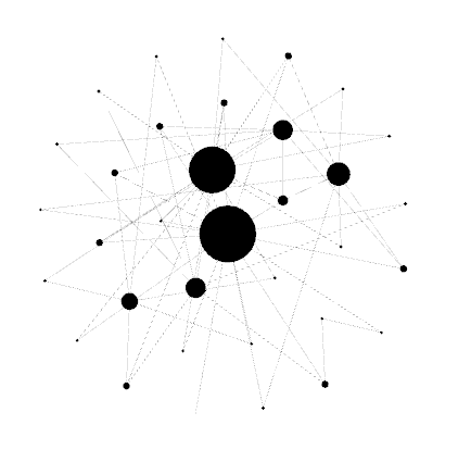
To make the center of the large nodes readable, on the left side tool bar, in the "Appearance" section's "Nodes" tab's "Partition" tab, select the artist palette icon and "Unique". Then click on the default grayscale coloring, and click "Apply". (If you want to add coloring the palette icon is where you do it, but I prefer to use grayscale for this graph.) 
Your graph will now look something like this. 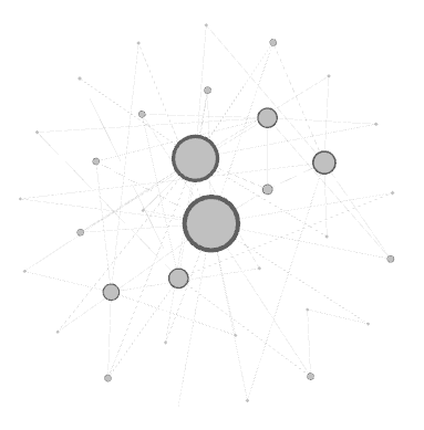
Set the node labels on the tool bar at the bottom of the "Graph" section. At the right end of the bottom toolbar is a stylized up-arrow (looks like a tiny house) which turns to a down arrow once you click it but also opens up the bottom controls. Then click on the "Labels" tab. Click the empty box to check the "Node" section. You can change the font or use the slider to make the labels larger or smaller. And now your graph is showing the labels for every node. 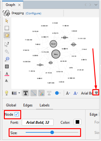
Set the edge size and color on the tool bar at the bottom of the "Graph" section. Click on the "Edges" tab. Use the slider to make the labels larger or smaller. 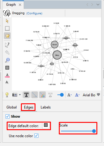
|
|
Here is how our final graph looks. 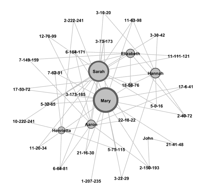
If we hover the cursor over a node, we can see all the other nodes to which it connects. If you then drag that node, you can adjust its placement in the graph. 
You can export the graph to a PDF file where it can be zoomed and shared. This is done in the "Preview" section but requires a good deal of tweaking since it is not WYSIWYG. I really just capture it as a screenshot with the Windows snipping tool and then save it to a file. I would really like to find a way to export the graph to a web page where it can be shared in a way that it can be interactively explored. But I have not really looked for that yet. |